整理一下相关的系统信息以及作用
uniapp相关的系统信息文档:
https://uniapp.dcloud.net.cn/api/system/info.html
获取系统信息
uni.getSystemInfo({
    success: function (e) {
		// e 包含各种系统信息
    }
});
titleBarHeight(标题栏高度)
const titleBarHeight = e.titleBarHeight;作用:
原生导航栏(标题栏)的高度
主要在支付宝小程序中使用
用途: 计算自定义导航栏的总高度
statusBarHeight(状态栏高度)
const statusBarHeight = e.statusBarHeight;作用:
手机屏幕最顶部显示时间、电量、信号等信息的区域高度
不同手机品牌和型号高度不同(通常20-44px)
用途: 避免内容被状态栏遮挡,需要给顶部留出这个高度的空间
getMenuButtonBoundingClientRect(微信胶囊按钮)
文档:
https://uniapp.dcloud.net.cn/api/ui/menuButton.html#getmenubuttonboundingclientrect
const menuButtonInfo = uni.getMenuButtonBoundingClientRect()作用:
微信小程序右上角胶囊按钮的位置信息
包含:top、bottom、left、right、width、height
自定义导航栏时,避免内容与胶囊按钮重叠
精确计算导航栏高度
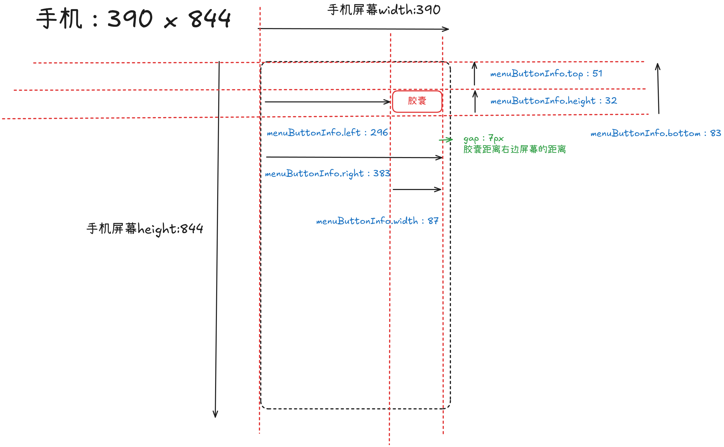
图片分解微信胶囊menuButtonInfo:
// iPhone 12
{
  bottom: 83,    // 胶囊按钮底部距离屏幕顶部的距离
  height: 32,    // 胶囊按钮的高度
  left: 296,     // 胶囊按钮左边距离屏幕左边的距离
  right: 383,    // 胶囊按钮右边距离屏幕左边的距离
  top: 51,       // 胶囊按钮顶部距离屏幕顶部的距离
  width: 87      // 胶囊按钮的宽度
}
使用场景:
const menuButtonInfo = uni.getMenuButtonBoundingClientRect()
const systemInfo = uni.getSystemInfoSync()

// 状态栏高度
const statusBarHeight = systemInfo.statusBarHeight  // 47px

// 胶囊与状态栏的间距
const menuButtonInfoAndStatusBarHeightGap = menuButtonInfo.top - statusBarHeight
// 51 - 47 = 4px

// 导航栏内容区高度 = 胶囊上下间距的2倍 + 胶囊高度
const navBarHeight = menuButtonInfoAndStatusBarHeightGap * 2 + menuButtonInfo.height
// 4 * 2 + 32 = 40px

// 导航栏总高度 = 状态栏高度 + 导航栏内容区高度
const customBarHeight = statusBarHeight + navBarHeight
// 47 + 40 = 87px

// 另:
// 导航栏总高度 = 胶囊按钮底部距离屏幕顶部的距离 + 胶囊与状态栏的间距
const customBarHeight = menuButtonInfo.bottom + menuButtonInfoAndStatusBarHeightGap
// 83 + 4 = 87pxcustomBarHeight也可以作为全局弹窗的margin-top,防止被胶囊覆盖。
安全区域属性
安全区域属性包含:
- safe-area-inset-top
- safe-area-inset-bottom
- safe-area-inset-left
- safe-area-inset-right
/* 完整的安全区域适配 */
.full-screen-content {
  padding-top: env(safe-area-inset-top);        /* 顶部刘海区域 */
  padding-bottom: env(safe-area-inset-bottom);  /* 底部Home区域 */
  padding-left: env(safe-area-inset-left);      /* 左侧(横屏时) */
  padding-right: env(safe-area-inset-right);    /* 右侧(横屏时) */
}
safe-area-inset-bottom(底部安全区域)
从 iPhone X 开始,苹果取消了物理Home键,改用全面屏设计,底部有一个白色横条(Home Indicator)用于手势操作。这个区域就是非安全区域。
作用:
底部非安全区域的高度(主要针对iPhone X及以上有"刘海"或"药丸"屏的设备,手机底部的白色横条)
底部的Home指示器区域高度
用途: 防止底部按钮或内容被Home指示器遮挡,确保可点击区域在安全范围内
视觉示意:
正常的显示
┌─────────────────────────────┐
│                             │
│                             │
│     应用内容区域              │
│                             │
│                             │
├─────────────────────────────┤ ← 这里是底部按钮
│  [确认]        [取消]        │ ← 可点击区域
├─────────────────────────────┤
│      ▬▬▬▬▬▬▬▬▬▬▬           │ ← Home Indicator (白色横条)
│   (非安全区域 ~34px)         │ ← 这部分是 safe-area-inset-bottom
└─────────────────────────────┘
❌ 不适配的问题
.footer-button {
  position: fixed;
  bottom: 0;  /* 直接贴底 */
  padding: 20rpx;
}
┌─────────────────────────┐ │ [确认] [取消] │ ← 按钮被遮挡 │ ▬▬▬▬▬▬▬▬▬ │ ← Home Indicator 覆盖在按钮上 └─────────────────────────┘在 iPhone X 上,按钮会被 Home Indicator 遮挡部分,用户点击时容易误触发返回手势。
✅ 正确适配
.footer-button {
  position: fixed;
  bottom: 0;
  padding: 20rpx;
  padding-bottom: calc(20rpx + env(safe-area-inset-bottom));  /* 关键 */
}
┌─────────────────────────┐ │ [确认] [取消] │ ← 按钮在安全区域内 ├─────────────────────────┤ │ │ ← 额外的 34px 空白 │ ▬▬▬▬▬▬▬▬▬ │ ← Home Indicator └─────────────────────────┘按钮会自动向上偏移 34px,避开 Home Indicator
safe-area-inset-top(顶部安全区域)
iPhone X 及以上设备顶部有刘海(或药丸挖孔),里面包含摄像头和传感器。这个区域无法显示内容,就是顶部非安全区域。
视觉示意:
正常显示:
┌─────────────────────────────┐
│  █████  12:30  █████ 100%  │
│  (摄像头)      (状态栏)      │ ← safe-area-inset-top (~44-50px)  刘海区域 (非安全区域)
├─────────────────────────────┤
│   ← 返回     页面标题    ⋮  │ ← 自定义导航栏(安全区域)
├─────────────────────────────┤
│                             │
│      应用内容区域             │
│                             │
└─────────────────────────────┘
❌ 不适配的问题
.custom-navbar {
  position: fixed;
  top: 0;
  height: 44px;  /* 固定高度 */
  background: #fff;
}
┌─────────────────────────┐ │ █████ █████ │ ← 刘海 │ ← [标题被遮挡] ⋮ │ ← 导航栏内容被遮挡 ├─────────────────────────┤ │ 内容区域 │✅ 正确适配
.custom-navbar {
  position: fixed;
  top: 0;
  padding-top: env(safe-area-inset-top);  /* 自动适配刘海高度 */
  background: #fff;
}

.navbar-content {
  height: 44px;  /* 导航栏内容高度 */
}
┌─────────────────────────┐
│ █████ 12:30 █████ │ ← 刘海区域(空白或背景色)
├─────────────────────────┤
│ ← 返回 标题 ⋮ │ ← 导航栏内容(清晰可见)
├─────────────────────────┤
│ 内容区域 │safe-area-inset-right(右侧安全区域)
在横屏模式下,刘海在右侧时需要避开的区域。
视觉示意:
正常显示
┌────────────────────────────────┬──┐
│                                │▓▓│
│  内容区域                       │▓▓│
│                                │刘│
│        横屏游戏/视频             │海│
│                                │▓▓│
│                                │▓▓│
└────────────────────────────────┴──┘
                                  ↑
                               right区域
                                (~44px)
❌ 不适配的问题
.video-close-btn {
  position: fixed;
  right: 20px;  /* 固定右边距 */
  top: 20px;
}
┌──────────────┬──┐ │ [X] │▓▓│ ← 按钮被遮挡 │ │刘│ │ 视频内容 │海│ └──────────────┴──┘✅ 正确适配
.video-close-btn {
  position: fixed;
  right: 20px;
  top: 20px;
  margin-right: env(safe-area-inset-right);  /* 自动左移 */
}
┌─────────────┬──┐ │ [X] │▓▓│ ← 按钮清晰可见 │ │刘│ │ 视频内容 │海│ └─────────────┴──┘
safe-area-inset-left(左侧安全区域)
主要在**横屏模式(landscape)**下使用,刘海或药丸在左侧时,需要避开这个区域。
视觉示意:
正常显示
┌──┬────────────────────────────────┐
│▓▓│                                │
│▓▓│  内容区域                       │
│刘│                                │
│海│        横屏游戏/视频             │
│▓▓│                                │
│▓▓│                                │
└──┴────────────────────────────────┘
 ↑
 left区域
 (~44px)
❌ 不适配的问题
.game-controls-left {
  position: fixed;
  left: 0;  /* 直接贴左边 */
  top: 50%;
}
┌──┬──────────────┐ │▓▓│ [↑] │ ← 方向键被刘海遮挡 │刘│←[●]→ │ │海│ [↓] │ └──┴──────────────┘✅ 正确适配
.game-controls-left {
  position: fixed;
  left: 0;
  padding-left: env(safe-area-inset-left);  /* 横屏时自动右移 */
  top: 50%;
}
┌──┬─────────────┐ │▓▓│ [↑] │ ← 按钮在安全区域 │刘│ ←[●]→ │ │海│ [↓] │ └──┴─────────────┘
成熟方案
代码参考:
https://github.com/unibest-tech/unibest/blob/main/src/utils/systemInfo.ts
已有成熟的方案
JS代码:
// 获取屏幕边界到安全区域距离
let systemInfo
let safeAreaInsets
// #ifdef MP-WEIXIN
// 微信小程序使用新的API
systemInfo = uni.getWindowInfo()
safeAreaInsets = systemInfo.safeArea
? {
top: systemInfo.safeArea.top,
right: systemInfo.windowWidth - systemInfo.safeArea.right,
bottom: systemInfo.windowHeight - systemInfo.safeArea.bottom,
left: systemInfo.safeArea.left,
}
: null
// #endif
// #ifndef MP-WEIXIN
// 其他平台继续使用uni API
systemInfo = uni.getSystemInfoSync()
safeAreaInsets = systemInfo.safeAreaInsets
// #endif
console.log('systemInfo', systemInfo)
// 微信里面打印
// pixelRatio: 3
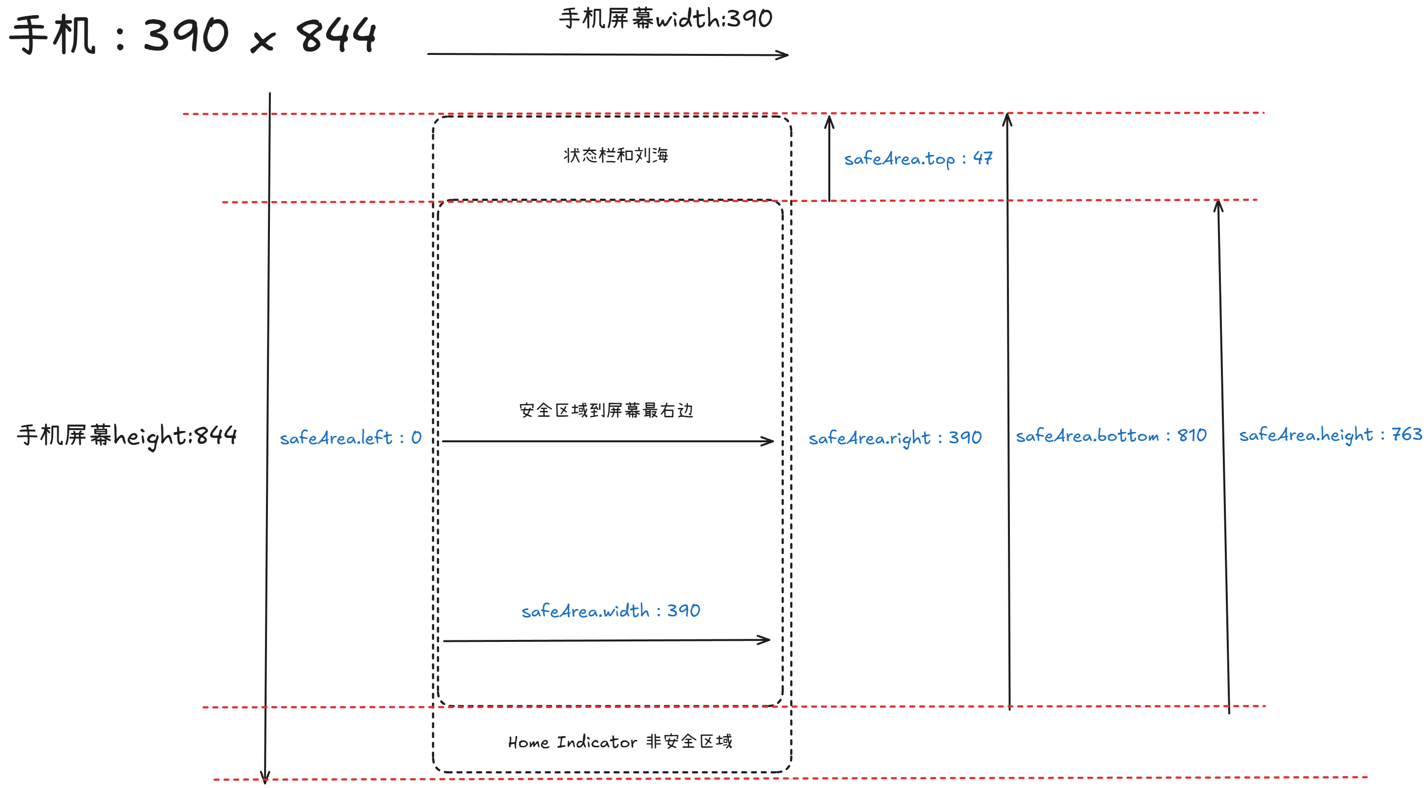
// safeArea: {top: 47, left: 0, right: 390, bottom: 810, width: 390, …}
// safeAreaInsets: {top: 47, left: 0, right: 0, bottom: 34}
// screenHeight: 844
// screenTop: 91
// screenWidth: 390
// statusBarHeight: 47
// windowBottom: 0
// windowHeight: 753
// windowTop: 0
// windowWidth: 390
export { safeAreaInsets, systemInfo }打印结果解读:
以iPhone12为例
| 设备型号 | 屏幕尺寸 | 竖屏 top | 竖屏 bottom | 横屏 left/right | 特征 |
|---|---|---|---|---|---|
| iPhone 12 | 390×844 | 47px | 34px | 47px | 刘海屏 |
| iPhone 12 Pro | 390×844 | 47px | 34px | 47px | 刘海屏 |
// 微信小程序打印结果
{
pixelRatio: 3, // 像素比(iPhone 的 Retina 屏)
// 安全区域(绝对坐标)
safeArea: {
top: 47, // 安全区域起始位置(状态栏下方)
left: 0,
right: 390, // 安全区域结束位置(屏幕宽度)
bottom: 810, // 安全区域结束位置(Home指示器上方)
width: 390,
height: 763
},
// 安全区域内边距(重点!)
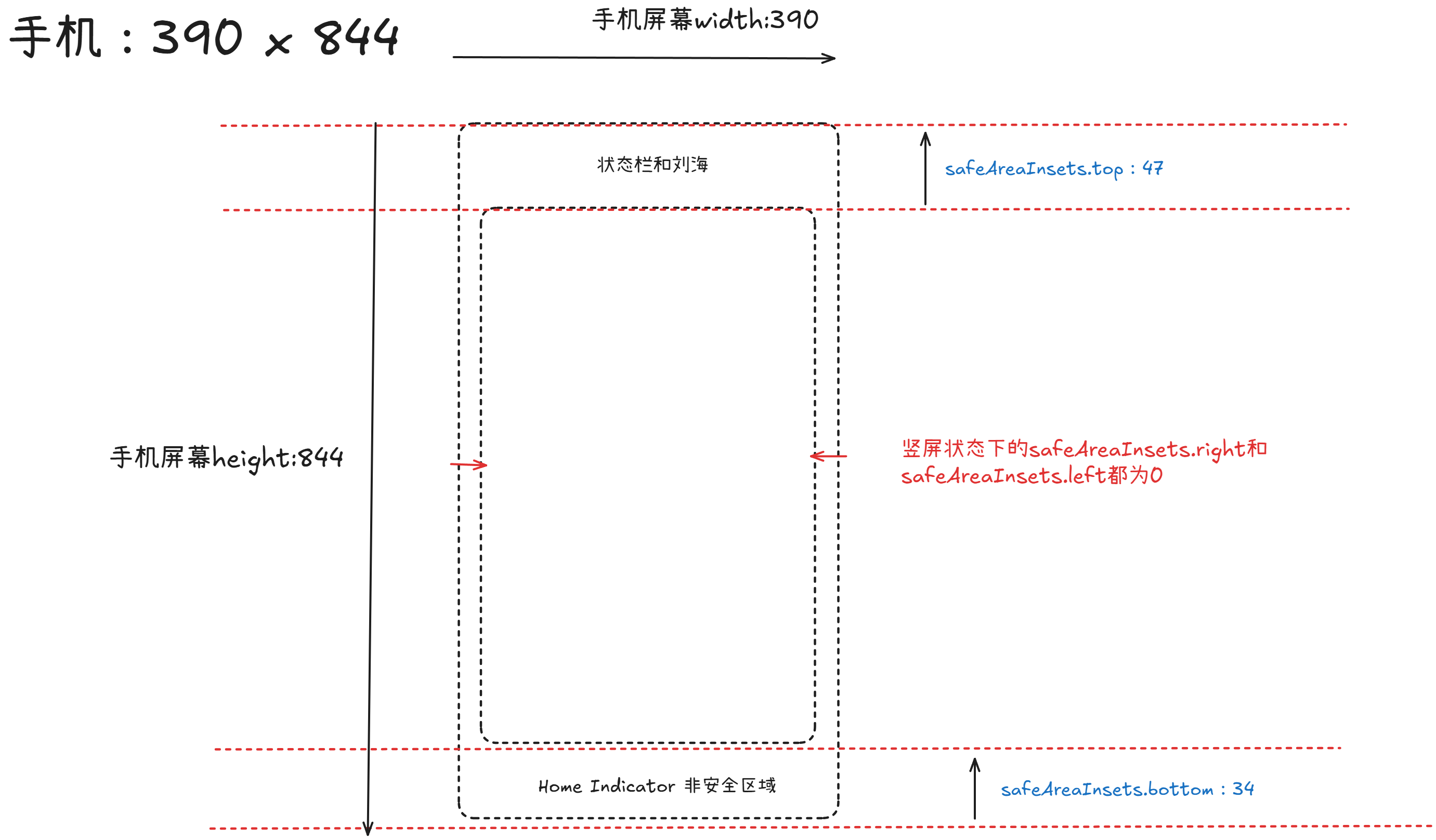
safeAreaInsets: {
top: 47, // 顶部需要避开 47px(状态栏+刘海)
left: 0, // 左侧无需避开
right: 0, // 右侧无需避开
bottom: 34 // 底部需要避开 34px(Home指示器)
},
screenHeight: 844, // 屏幕物理高度
screenWidth: 390, // 屏幕物理宽度
statusBarHeight: 47, // 状态栏高度
windowHeight: 753, // 可用窗口高度(844 - 状态栏 - tabBar等)
windowWidth: 390 // 可用窗口宽度
}图片分解safeArea(安全区):
图片分解safeAreaInsets(安全区留白):
safeAreaInsets分为两个方向,竖屏Portrait和横屏Landscape
竖屏:
// iPhone 12 竖屏
safeAreaInsets: {
  top: 47,      // 顶部刘海区域(状态栏 + 刘海传感器)
  left: 0,      // 左侧无需避让
  right: 0,     // 右侧无需避让
  bottom: 34    // 底部 Home 指示器手势条
}
横屏:
横屏分为左横屏和右横屏
// iPhone 12 横屏(刘海在右)
safeAreaInsets: {
  top: 0,       // 顶部无刘海
  left: 0,      // 左侧无需避让
  right: 47,    // 右侧刘海!
  bottom: 21    // 底部仍有少量手势区
}
// iPhone 12 横屏(刘海在左)
safeAreaInsets: {
top: 0, // 顶部无刘海
left: 47, // 左侧刘海!
right: 0, // 右侧无需避让
bottom: 21 // 底部仍有少量手势区
}对照表格:
| 屏幕方向 | 屏幕尺寸 | top | left | right | bottom | 可用区域 |
|---|---|---|---|---|---|---|
| 竖屏 | 390×844 | 47px | 0px | 0px | 34px | 390×763 |
| 横屏左(刘海在左) | 844×390 | 0px | 47px | 0px | 21px | 797×369 |
| 横屏右(刘海在右) | 844×390 | 0px | 0px | 47px | 21px | 797×369 |
最佳实践:
/* 1. 使用 CSS 环境变量(推荐) */
.element {
  padding: env(safe-area-inset-top)
           env(safe-area-inset-right)
           env(safe-area-inset-bottom)
           env(safe-area-inset-left);
}

/* 2. 叠加自定义边距 */
.element {
  padding-bottom: calc(20px + env(safe-area-inset-bottom));
}